A New Layout for Discover Albia
 It’s an exciting day for Discover Albia! After about three years with nearly the same layout, the day has finally come for a much needed layout update. Navigation should be a bit easier, and page load times should be vastly improved! It might feel a little bare or minimalist for a time, but I think everyone needed a break from the cluttered space that was taking over the old layout! Plus, this new one features some very cute C1 bees. Can’t go wrong with them! Aside from their stings.
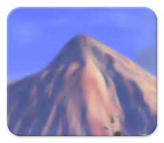 The most obvious change is the new logo, which breaks away from the original mountain in favor of a Creatures 1 theme with a little more intrigue. I also had a fun time turning this scene into a sort of watercolor… No errant pixels to haunt the screen here! Getting to this new layout was a bit of a challenge, but it’s been well worth it. It would have been nice to unveil the face lift a few days ago to commemorate three years, yet today is pretty close! Now I have ample time to devote to my Creatures 1 spriting project. I made a lot of progress last week, and I’m pushing myself to have the first round of testing done later this month. Baby male Banana Norns will be the first to be available!
Special thanks go to Karias, TheSecond, Nutter, Rascii, and LilyNorn at Creatures Caves for their feedback and time! A few changes were made based on their input, which should improve readability. Feel free to leave any comments about the new layout: I always try to make things as easy and enjoyable for visitors. My Norns will enjoy making their first appearance in this new layout soon: Get ready to read more about them!


Congratulations on the new layout! :)
Thank you, Nutter! Seems to be working out very well. There are a few minor spacing issues with old posts, but nothing that should take away from the actual content. I love seeing these little beehives all over, too!
The new layout looks less visually interesting than the last one, but organization-wise it beats out the old one by a mile. It’s going to take some getting used to, but I like it so far.
One odd thing I noticed, however: For some reason, the links section has the old name of my blog listed, and it’s kinda bothering me.
Thanks, Grendel Man! I’m going to be adding a background image eventually: I just needed a breath of fresh air with a simple, clean layout for the moment. I might also be able to spruce things up a little more without cluttering the whole thing up like before!
That’s my fault about the blog name. I thought the list was pulled automatically, but apparently it’s done manually. I’ve updated it! I actually noticed it before and it didn’t dawn on me that the name of the blog was wrong. Again, sorry about that!
I really like the new layout – it’s cleaner and easier to read and it loads a lot faster than the previous one. :)
Thanks! It was really getting slow on the home page, even with showing just one post. Now it’s easier to keep track of the newest posts on the home page without having to scroll down and wait for everything to load! I have some ideas in mind for adding more color, but I’m really enjoying the white space!
What? The blog… It looks all… weird… Not bad!